blainehansen
Skiracing Subscribe Page Improvements
A streamlined and intuitive subscription page to reduce complaints to the skiracing.com team.
published: December 1, 2016 - last updated: May 13, 2024
The site was having trouble handling the workflow for renewing their expired Premium users. Since the site didn't have any functionality in place to automatically renew their users' accounts (they were uncomfortable about making such a big change), the users needed to be directed by email reminder or by prompts on the site to buy another year of their premium subscription.
At the time I was brought on, there was a confusing conflict in purposes between two pages on the site, /renew-account, and /subscribe-now. Both allowed for similar actions to be taken by the users, but neither could handle all of their needs, and there wasn't any behavior in place to automatically direct a user towards the page that made more sense. Instead both pages relied on text prompts to simply request that the user navigate towards the correct page. The team was receiving many complaints from people confused about the status of their account, and about how to renew or proceed based on emails they had received. It was a bad situation for the business to be in, since team members were burning away time guiding users through the process and communicating with them instead of focusing on more long-term tasks.
I decided I was simply going to fix this problem. By streamlining the relationship between the pages, their individual behaviors, and their UI designs, I intended to make the whole thing completely idiot-proof for all the users. My goal was no more complaints based on confusion.
§ Cut away the useless.
The first realization was that the /renew-account page needed to go. It was potentially useful as a landing page given to users in an email reminder, but overall it was just confusing everyone and completely unnecessary. The /subscribe-now page instead needed to be smart enough to handle all users in all states.
So, the /renew-account page was kept, but I removed any links to it from the website, and it was only sent to users in email reminders. Furthermore, it only does two things:
- Check if the user is logged in. If not, allow them to log in.
- Either after they log in, or if they were already logged in, simply redirect them to the
/subscribe-nowpage.
§ Make what you have left better.
To make the /subscribe-now page as smart as it needed to be, it had to have four states:
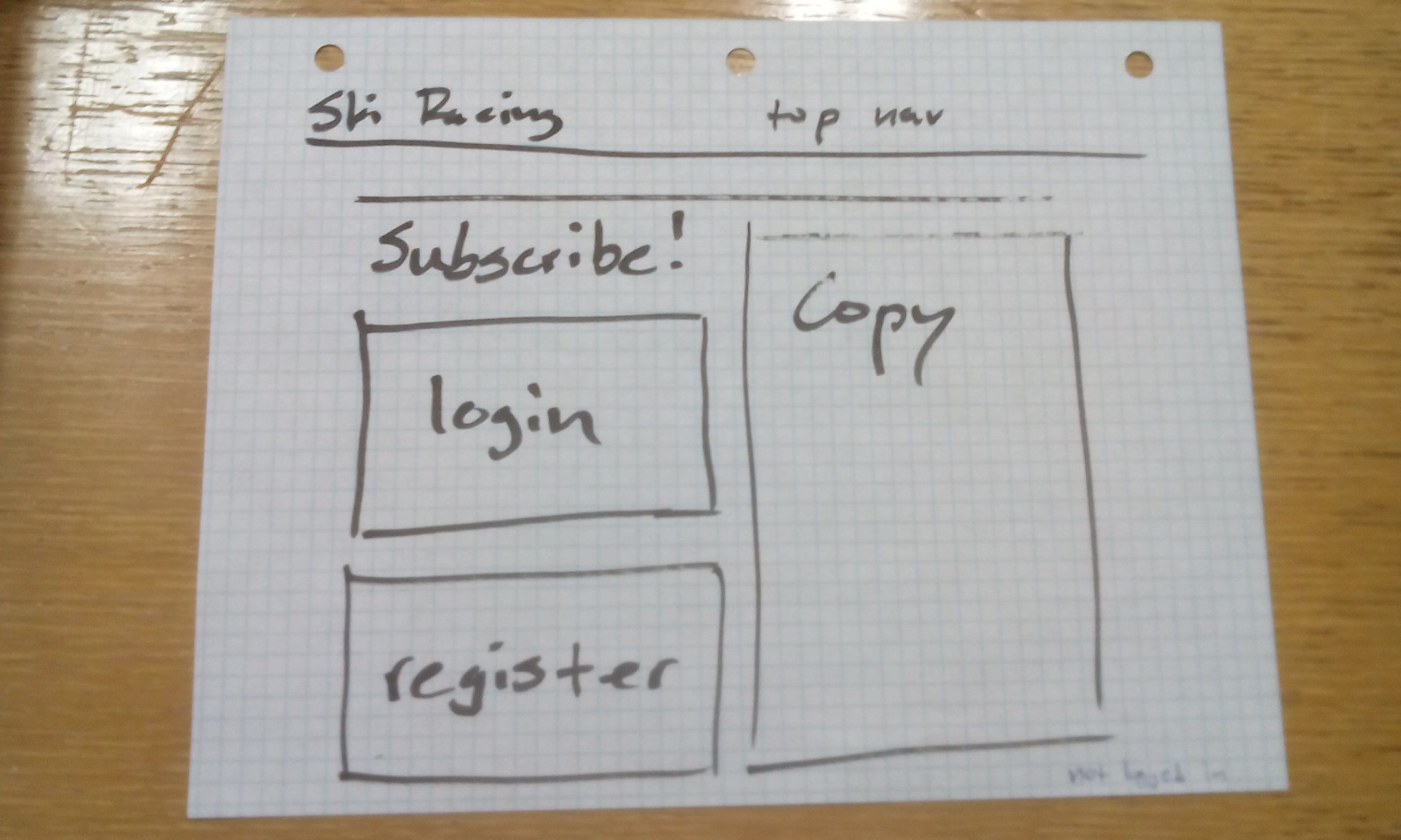
Not logged in user. Display login form in a preferred/priority way so that users are encouraged to do that first. If the user does have an account but aren't logged in right this second, everything we do is a waste of time until they log in. Getting them to do so is essential to successfully directing them towards the next actions. Display register form as well for those to whom the login form doesn't apply. Show any sales copy to persuade them of the value of the site.
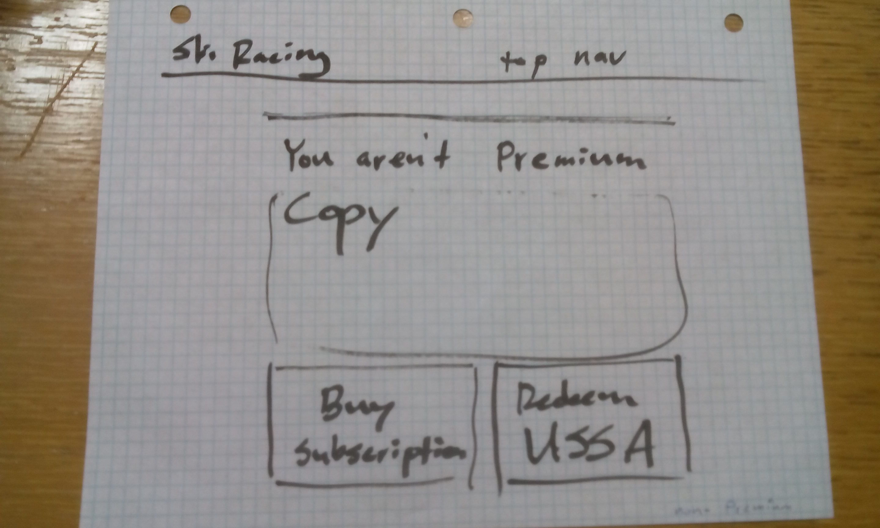
Logged in user without a Premium membership. Tell them they are a subscriber but don't have Premium access. Give them the option to redeem any relevant codes or buy a Premium membership. Present those options in an "equivalent" way, since they're equally preferred just depending on the user's situation. Also give whatever sales copy.
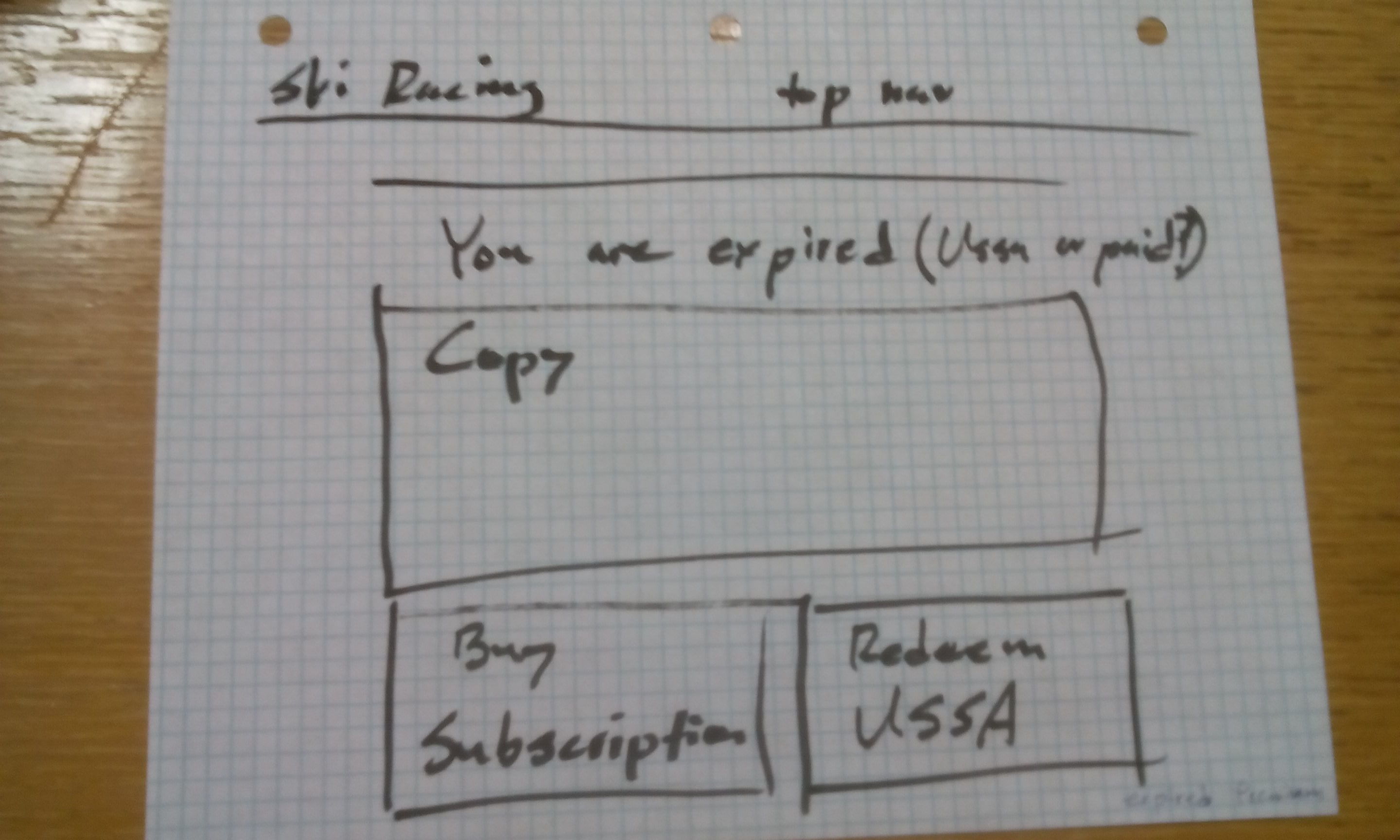
Logged in user with an expired Premium membership. Tell them their status, detect if they've ever paid or had a gift code and tell them this, give them the option to buy another year or redeem another code. Also give whatever sales copy.
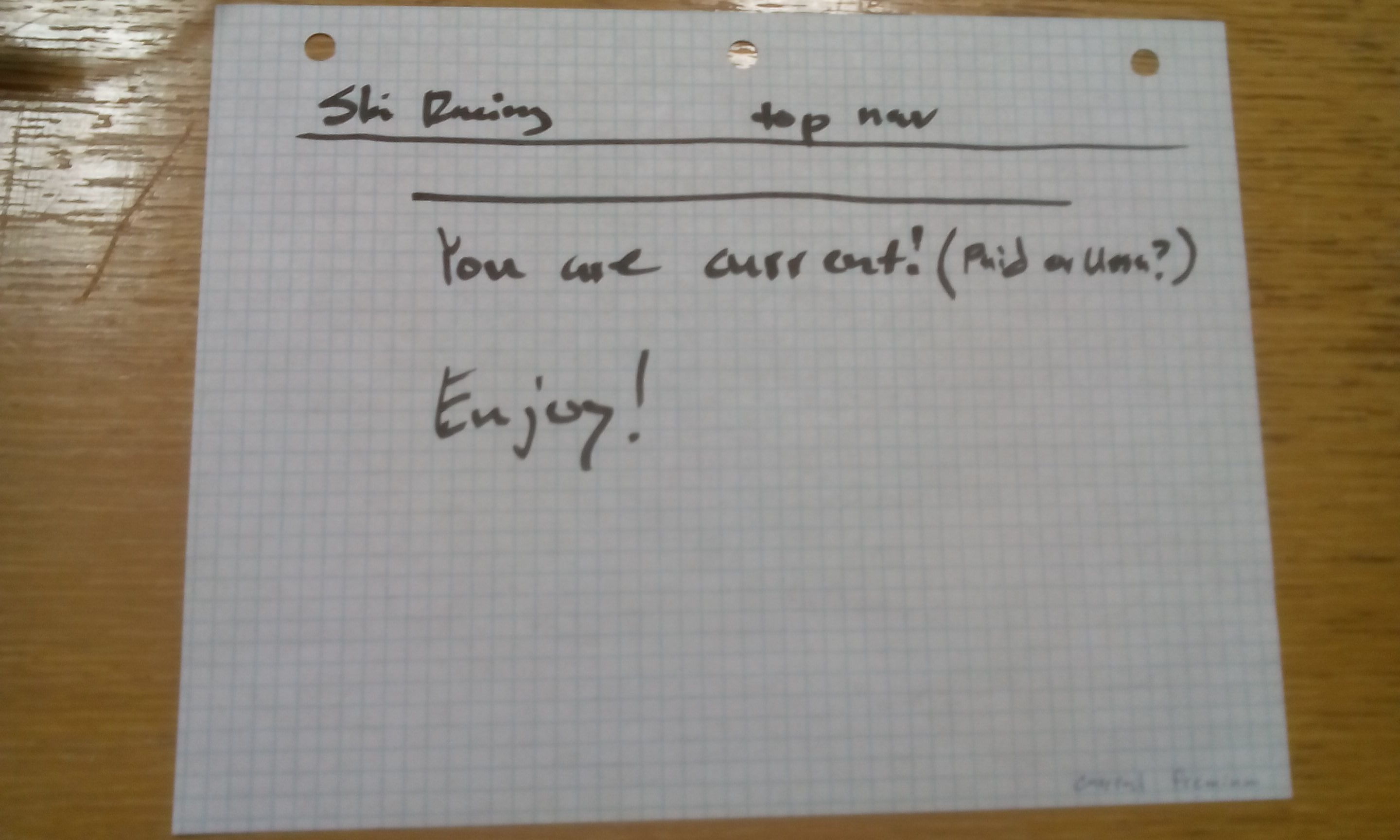
Logged in user with a current paid Premium membership. Tell them their status, that nothing more is required of them, and wish them a good day! It was briefly considered that we redirect them away from the page, but I felt it was important that they receive absolutely positive confirmation that they didn't need to take any further action, and be allowed to go from there however they pleased.
Throughout considering these different states, it was important for me to ensure that no matter what state a user was in, pushing them towards taking the next steps and making those next steps as easy as possible was a paramount concern. The page needed to do the team's work for them, and make improving the success of the site automatic.
To help myself decide what layout would best achieve these different goals, and to help the team see what I was saying, I even made some crude drawings and emailed them out. I'm no artist or illustrator expert and I have awful handwriting, so crude is an understatement. But I have studied UI design patterns a fair amount, and love designing interfaces for maximum usability, so it was still a useful thing to do.
These layouts have the primary goal of directing the user's attention through the most important actions by attempting to take advantage of things like the Gutenberg Diagram and the F-Pattern (opens new window), which aren't hard and fast rules but are useful patterns.
Some of my specific thoughts were as follows:
The login form should be displayed above and aligned with the registration form. Placing something above something else is a visual cue that that thing is of higher importance or priority or ordering than other things directly below it. This ensures that users are most pushed towards first considering logging in, and only registering if logging isn't a valid choice for them.
The copy should be displayed alongside and probably to the right of the login/registration forms, in its own column. This cues to the user that acting on the forms or reading the copy are equivalent but separate, with the forms on the left-hand side being given slight preference. This also allows the user to consider their choices at the same time as they're reading the copy, without having to scroll to switch between the copy and the forms.
I also felt it was wise to get rid of the sidebar on that page. Since this isn't a content presentation page, but rather a critical functionality page where the user is making important decisions about the nature of their registration, the page should be given as much real estate as possible and should visually focus on the sales copy and the options being presented. It shouldn't clutter the user's thoughts with any other options that aren't relevant to their registration.
The team was thrilled with these suggestions, and I was given some design documents following my specifications and given the go-ahead to make all changes. The first thing I did was give myself a helper function allowing a quick determination of the user's account status.
function current_user_account_status() {
	$user_id = get_current_user_id();
	if ($user_id == 0) return 'no-account';

	if (leaky_paywall_subscriber_current_level_id() !== "0") return 'non-premium';

	$user_expires = get_user_meta($user_id, '_issuem_leaky_paywall_live_expires', true);

	if ($user_expires <= date("Y-m-d")) return 'expired';
	else return 'current';
}
With this function in hand, I then leveraged it on the subscribe page itself:
switch (current_user_account_status()) {
	case 'no-account':
		// relevant templating
		break;
	case 'non-premium':
		// relevant templating
		break;
	case 'expired':
		// relevant templating
		break;
	case 'current':
		// relevant templating
		break;
}
and on the site's navigation user icon area. I thought it would be useful to keep the user updated about their account at all times, so that even if they ignored a reminder email or other prompts, they would be aware their status had changed. This was a simple way of achieving that.
echo current_user_moniker();
switch (current_user_account_status()) {
	case 'non-premium':
		echo " (Not Premium)";
		break;
	case 'expired':
		echo " (Expired)";
		break;
	default:
}
A pop-up modal dialog was discussed that would prompt users to take these kind of advancement actions, but the site's design isn't responsive, so modal dialogs are a usability nightmare waiting to happen for all their users currently dealing with the site on mobile. The fact that the site isn't responsive is a huge problem and I've been consistently urging them to commit to that project as soon as possible, but they're justifiably scared to do so. Wordpress sites have a tendency to become a horrible html/php spaghetti mess, and their site is quite old now. Without a very handy sass-only responsive framework available, capable of changing the design of the site without modifying the difficult to work with templates as is necessary with libraries like Bootstrap, it promises to be a huge project. I've actually been developing an open source framework just like that for that very reason. Hopefully that comes together soon!
The new subscribe page was a success, and the team immediately starting receiving many less complaints about this workflow. After not very long, the team stopped bringing these sorts of issues and complaints to me at all, so I think the goal of making this page idiot proof and effortless has been achieved.